Life Expectancy in the Soviet Union
Part II: Ranking its position

I will rank the life expectancy at birth in the constituent national republics of the Soviet Union in the period starting in 1960 and ending in 1984. This post will concern itself with figures for both genders. The gendered analysis will come next (which paints a worse picture for the Slavic and Baltic republics compared to just a simple average).
The main conclusions are:
The main progress in life expectancy for the Soviet Union has already happened in Baltic and Slavic republics by the 1960s and since then we see mostly stagnation or deterioration with them losing their relative positions in the world.
The overall outcome in life expectancy for the Soviet republics since the 1960s wasn’t better than world’s average but worse.
It doesn’t try to establish causality of any sort, doesn’t blame the “economic systems”, it’s a purely descriptive exercise.
Data Note
I use the series from World Bank for Life expectancy at birth, total (years)(SP.DYN.LE00.IN) provided to them by the UN for purposes of the data standardisation.
The classification of the country by a region is done by using Varieties of Democracy’s e_regionpol_long coder.
Following it, Yugoslavia is generally included into the “Socialist Eastern Europe” (which makes its result better because Yugoslavia has generally better growth rates).
Moldova is coded as “Slavic Republic” sometimes because I didn’t want to leave it alone, “Albania” and “Mongolia” are often avoided for the same reasons.
The year 1960 is used because UN starts proper collection in 1960 and 1984 is used in the converge diagrams to not deal with the effects of anti-alcohol campaign in the Soviet Union.
One can note that there are good reasons to think that relatively good outcomes of the pre-70s Soviet Union were mostly a result of bad reporting standards throughout the entire Union, it’s especially visible in the places like Moldova, but it’s a different story.
General Life Expectancy Time Series
Let us look at how the life expectancy evolves in the Eastern Block in general and how it compares to other regions.
If we look at Figure 1, we can see that Eastern Block starts very strong. It’s greatly due to very high position of the Slavic and Baltic Republics in the 60s. But we can see that with time, it loses its relative lead and by the end of the Soviet Union, it comes close to the averages of the Middle East.

Figure 1. Average of Life Expectancy by Region On the Figure 2, we can see that the countries of the Eastern Block have one of the lowest absolute increase in total life expectancy at birth, followed only by already very well-off Western Europe and Northern American Offshoots. It’s not surprising by itself, because it starts quite high.

Figure 2. Average Change in Life Expectancy By Region If we disaggregate the Eastern Block into Yugoslavia, subregions of the Soviet Union and other socialist Eastern Europe, we can see on the Figure 3 that the developed Soviet subregions (Slavic republics, Baltics) and socialist Eastern Europe will be the worst performing regions in the world by added life expectancy.
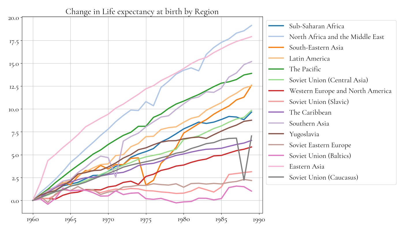
Figure 3. Average Change in Life Expectancy by Region, Soviet Union disaggregates into subregions To track changes in life expectancy, one can look at ordinal and not cardinal metrics. Figure 4 ranks countries of the world by life expectancy and shows a rank of the countries of the Eastern Block each 5 years. As we can see, the richer regions of the Soviet Union start with very decent position but slowly slide down on the ladder through the years.
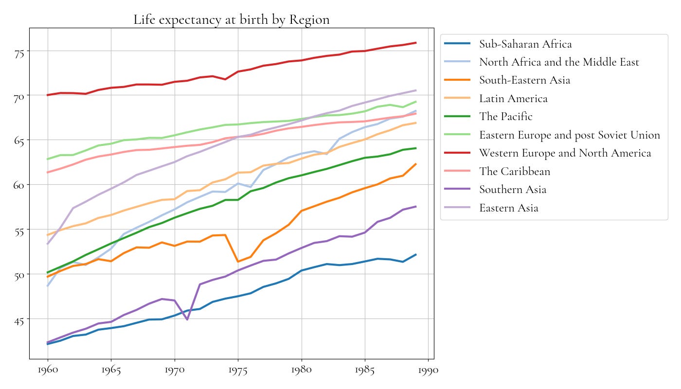
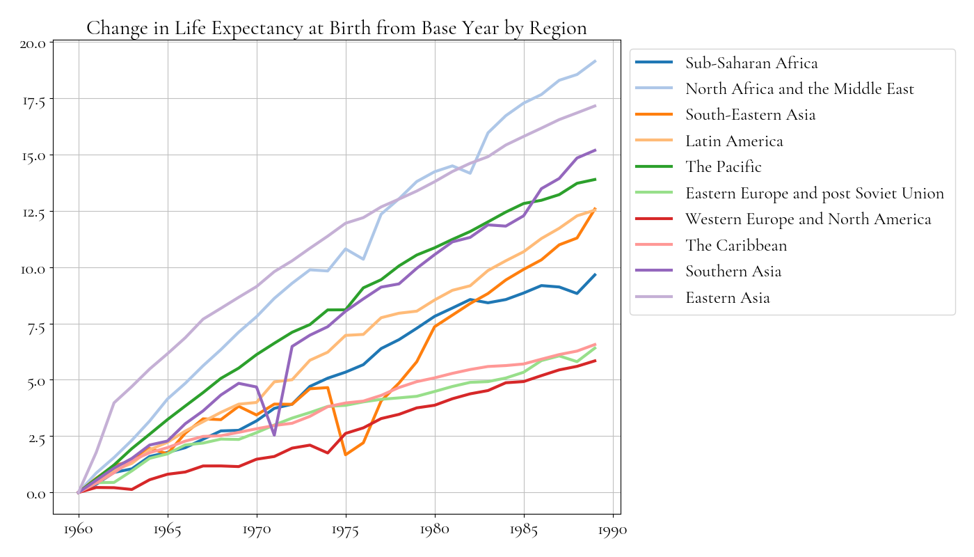

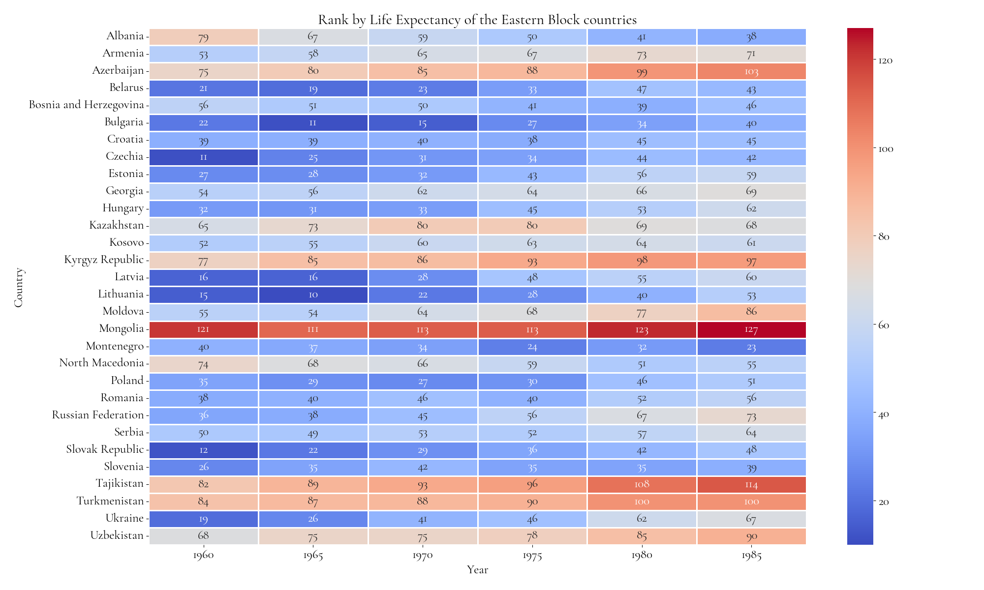
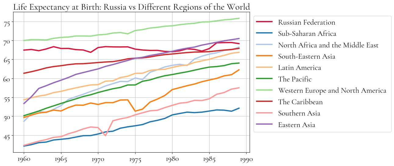
Figure 5 is analogous to the Figure 1, and tracks the evolution of the Russian life expectancy relative to regional averages in particular. As we can see, Russian life expectancy just outright converges with the average of the Middle East.
Comparing with the Neighbors
I think it would be pedagogical to look at the differences between particular countries and their cultural or geographic neighbors. It’s a cherry picking to some degree, but it shows us the initial strong relative positions that gets eroded with time since the 70s.
One can see, that the outcomes are worse for the more developed European regions and are relatively normal for Central Asia and Caucasus.
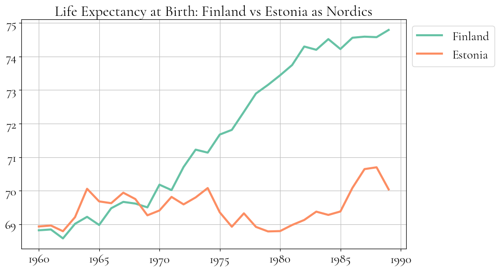
On Figure 6, we seen how Estonia and Finland track each other until the 1970, and then Finland has a rapid progress while Estonian life expectancy even declines with time.
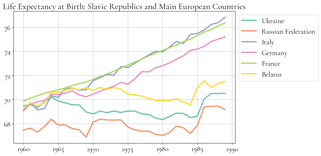
On Figure 7, we see how Slavic Republics of the Soviet Union could have been favorably compared to the richest big countries of the continental Europe, but they start to decline around 1964-1965 with a gap growing massively by the 1980s.
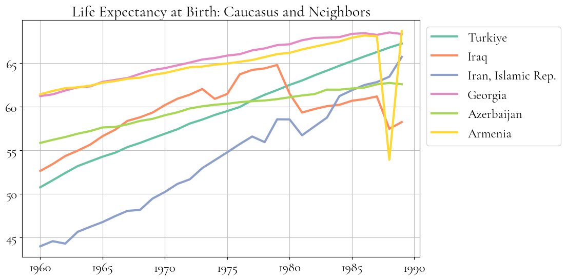
A somewhat similar picture can be seen on the Figure 8, the Soviet Caucasus has a strong initial positions and continues to grow in the opposition to the Slavic or Baltic republics, but it grows slower and by the 1990s, the gap is getting closed with countries like Turkey and Iran. The particularly alarming is underperformance of Azerbaijan that has the life expectancy close to war torn Iraq (although one shouldn’t place a lot of faith in Iraqi statistics both before and after the war).
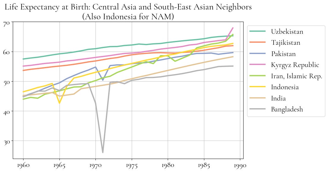
Similarly in the continuation of the established trend, the Soviet Central Asia starts very strong, but ends up having slower growth rates and mostly starts to converge with the South-East Asian countries by the 1990s.
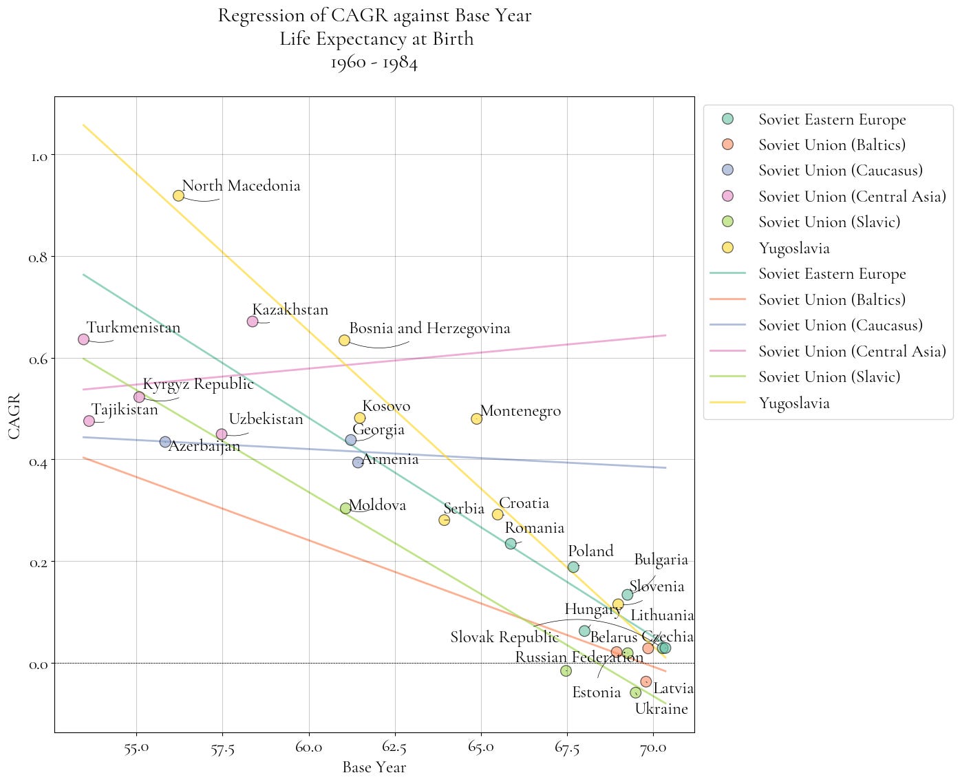
Convergence diagrams
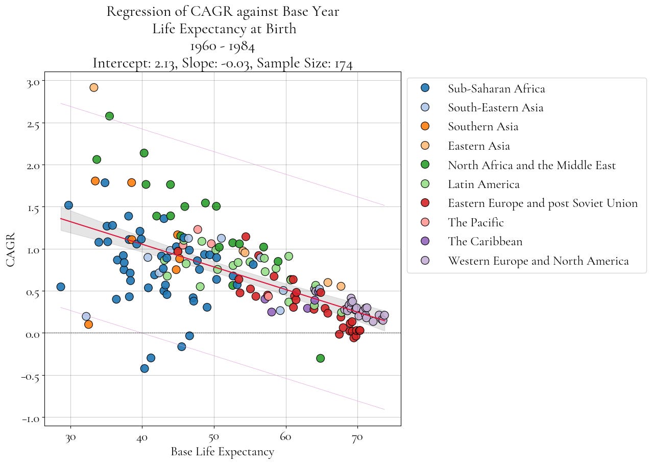
This is a more complicated type of the diagram. How does it work?
We take the life expectancy values at the years of 1960 and 1984, then we calculate CAGR (compound annual growth rate).
Value at 1984 - Value at 1960 ^ (1/(1984 - 1960) - 1) × 100
Then we plot the pairs of (value in the base year, CAGR) for each region or each country to show how fast this entity has grown in a time period. Also, we fit a regression to show a general trend in life expectancy growth with the respect to a base year.
As we normally assume the declining returns to effort or a linear increases, the diagram will normally have a negative slope and will look like some kind of a triangle.
On Figure 10, we plot this type of diagram of geo-political regions and can see that overall, the Eastern Block has countries with very high life expectancy at the start but also has below the average annual growth rates for places that started with larger life expectancy in a base year.
The diagrams on Figure 11 and Figure 12 do the same exercise but with looking at Eastern Block with an addition of the rich Western Capitalist countries and then Latin American countries. The Western countries create a comparator for initial high values while Latin America fills the middle.
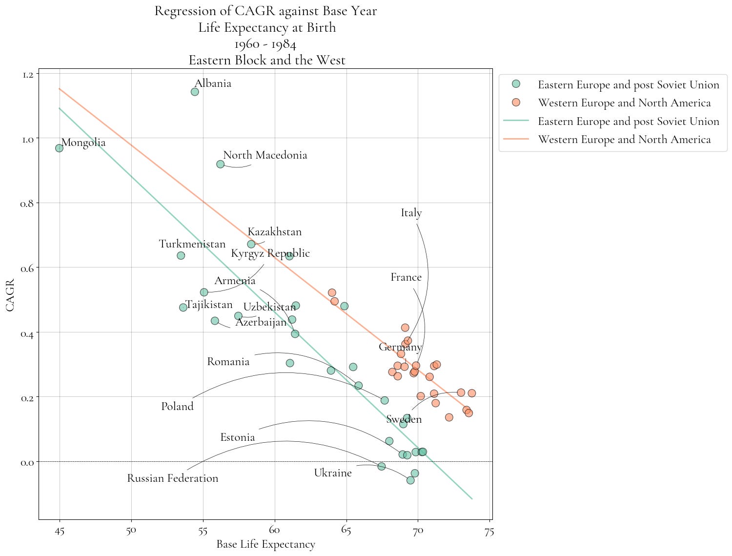
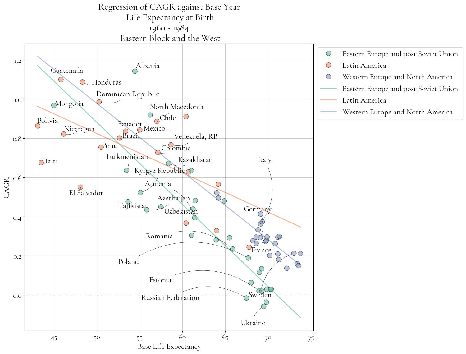
Figure 13 does the same type of a diagram but for the Eastern European subregions like Yugoslavia and regions within the Soviet Union. From it, we can see that both non-Soviet communist Eastern Europe and Yugoslavia have generally somewhat better performance.