Convergence of Life Expectancy in Latin America
Presented in graphs and told through convergence with Cuba
There are two ways how the popular discourse treats Cuban outcomes in health. The first one is to tell how exceptionally good they are and how everyone should look at them for an example and how it proves the supremacy of Cuba's political economy. The second one is to try to persuade them that Cuban health outcomes are not particularly good. This post will try to present a story about life expectancy at birth with accents different from these points. My thesis is that:
Cuban life expectancy is still exemplary in Latin America
It was so before the Cuban Revolution
The gap started to close after the Cuban Revolution
Cuba's evolution is not exceptional but quite ordinary
Cuba among other countries
Cuba continues to be a leading country in Latin America by life expectancy at birth.
Here we will try to illustrate it by using different averages and show how Cuba relates to them. Still on the top, but as we see, the gap is getting smaller and in the last years it started to lose the leading position.
To illustrate the closure of the gap more, we can plot just the differences between the averages and the value for Cuba:
As we see, both the lowest values, the median, and the average are getting closer to the current Cuban position.
To illustrate the process of convergence better, we can plot the life expectancy from the year 1960 and the average annual gains in the period 1960-2019. Here we can see that countries that had the better results initially were growing the slowest and the countries that had the lowest life expectancy at the start were growing the fastest (cheers for our Peruvian brothers). Cuba had quite slow growth, but it wasn’t unusual and unexpected, it just started from a relatively high position!
Here is a boxplot of the same process to illustrate the process from a somewhat different angle (Cuba is excluded from aggregate):
Next, we can look at the evolution of life expectancy in Cuba relative to other countries in the world, not only in Latam:
And the convergence diagram for the entire world, and different regions have been indicated on the graph. We see Cuba is laying at the line and its evolution was not particularly unusual, once again, it started relatively high and then had slow growth.
Sources:
https://ourworldindata.org/life-expectancy
Methodological note:
The entire procedure was redone with the life expectancy measures sourced from the varieties of democracy, the results are similar, you can look at all graphs here, also including the correlation of GDP with life expectancy in different years from Fariss et al. (2021).
Comment policy: all non-factual comments will be deleted
You can stop reading here & Dumb memes
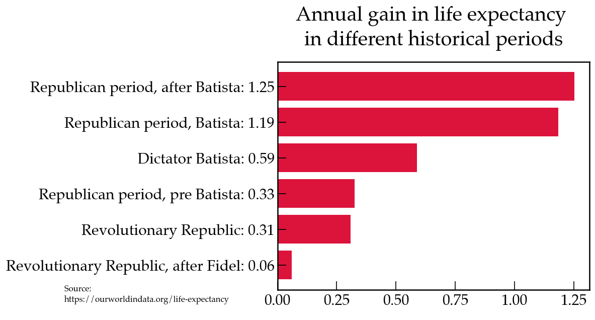
If you looked at the graph, you could get the idea that the major gains happened actually before the Cuban revolution and the growth was actually faster before than after. Here I present diagrams on the topic, let us praise the infinite wisdom of Batista:


